
Form validation with Ember.js
Forms on websites are so ubiquitous and so much taken for granted that they are rarely given much thought. Even so, every Internet user would probably find it easy to recall a form that does not work as well as it should. Variations seem to be endless and in particular regarding form validations there are still a lot of flawed implementations out there, even in 2017.
What makes a good form?
Most of the aspects which need to be taken into account for forms and their validation are already clearly demonstrated in a simple registration form:

- Do I know in advance which entries will be required in the various form fields?
- When am I notified about possible errors in my entries?
- Can I correct these errors easily enough?
A good metric for the quality of a form is the average time needed by a user for its completion. A search for “best practices” for form validation brings up a range of good articles, which compare different versions.
Instead of jumping directly to specific recommendations for the creation of good forms, it is worthwhile taking a look at a few basic rules for the design of user interfaces first. Some entries from Aral Balkan’s “User Interface Design Principles”can be applied directly to forms and their validation:
- Prevent, don’t scold: A good UI prevents errors, rather than reprimanding the user with error messages.
- Give sufficient feedback: The user should never have to ask themselves whether a certain action just worked or not. The UI maintains a constant dialogue with the user by providing visual feedback.
- Innocent until proven guilty: An error message for a form field should only appear after the user has completed their input in the field.
From the basics, together with the results of the various studies, we can define some requirements for a good form:
- The information on the form is helpful. In addition to a descriptive label for the form field, this also includes a descriptive text if required. This should be based on the likelihood of the user making a mistake. A description of “Max. 50 characters” in the username field does not make a lot of sense, but a hint in case of an exotic password policy (“at least 8 characters, no special characters except _ . :”) is more useful.
- After completion of the entry, the user receives immediate feedback: Error messages are displayed on exiting the form field (
onBlur).
Forms in Ember.js
Now it is time to apply what you learned in the frontend framework of choice. At Adfinis SyGroup, this is currently Ember.js.
As already familiar from the world of JavaScript, there are many different solutions for each problem. Ember Observer lists 32 add-ons in the form category, Google finds 222,000 results for ember form validation. Some results, however, deserve to be highlighted:
- ember-validations: No.1 in the Google search results, 873 Github stars. But the first sentence in the README is:
> This addon is no longer actively developed. At DockYard we have switched over to using ember-changeset-validations together with ember-changeset. - ember-changeset: Provides a so-called
changeset, which can represent changes on an Ember model including possible validation errors. Along with ember-changeset-validations, it forms a good basis for validations of all types. - ember-form-for: First search result on Ember Observer. Provides a very simple and convenient API for the definition of form fields:
{{#form-for newUser as |f|}}
{{f.text-field "firstName"}}
{{f.text-field "lastName"}}

{{f.select-field "gender" "unknown male female"}}
{{f.date-field "birthDate"}}
{{/form-for}}
Unfortunately however, ember-form-for does not offer an “out-of-the-box” support for hiding validation errors until the user has interacted with the respective field (see issue #122).
This situation led to the creation of the new add-on ember-validated-form in our last Ember project, which provides a similar API as ember-form-for and relies on ember-changeset and ember-changeset-validations for the validations. We have the following objectives with the add-on:
- Explicit focus on form validation. Client-side form validation should not just be a secondary aspect, but the main focus.
- Out-of-the-box UX. Error messages are only displayed
onBluror after clicking the submit button. - Keep it simple. Instead of implementing a wealth of different form components, it should be possible to add your own special form elements yourself.
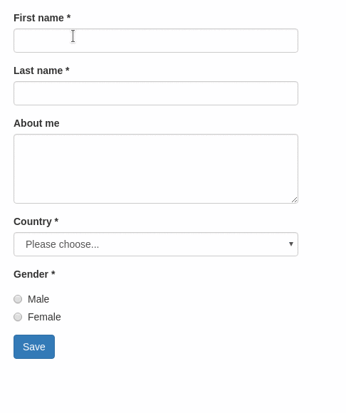
Here’s an example for a typical template using ember-validated-form:
{{#validated-form
model = (changeset model UserValidations)
on-submit = (action "submit")
submit-label = 'Save' as |f|}}

{{f.input label="First name" name="firstName"}}
{{f.input label="Last name" name="lastName"}}

{{f.input type="textarea" label="About me" name="aboutMe"}}

{{f.input
type = "select"
label = "Country"
name = "country"
options = countries
value = model.country
}}

{{f.input type="radioGroup" label="Gender" name="gender" options=genders}}

{{/validated-form}}
Ember-changeset-validations is used for the validation rules:
// validations/user.js
import {
validatePresence,
validateLength
} from 'ember-changeset-validations/validators';

export default {
firstName: [
validatePresence(true),
validateLength({min: 3, max: 40})
],
lastName: [
validatePresence(true),
validateLength({min: 3, max: 40})
],
aboutMe: [ validateLength({allowBlank: true, max: 200}) ],
country: [ validatePresence(true) ],
gender: [ validatePresence(true) ]
};
Together with Bootstrap, the result then looks approximately like this:
…and you can also try it yourself.
Conclusion
Form validation is not a simple subject and, like always, there is no “one size fits all” solution.
But with ember-validated-form we hope we can contribute to reducing the number of frustrating forms that can be found on the web. We appreciate any kind of feedback on Github!
